Top 5 Interior Design Mistakes and How to Avoid Them
[Disclosure: Some of the links are affiliate links, meaning, at no additional cost to you, I may earn a commission if you click through and make a purchase.]
Stop! Before you close out your online purchase in your cart... read this! It will help put an end to the most common (...though well-intended) interior design mistakes. By reading this, you’ll avoid a few costly mistakes and feel empowered to confidently make timeless design choices for your home.
As you dive in, you’ll understand why some of these mistakes not only look bad but can also hurt your home’s value (ouch!). We’re still in an exploding real estate market; don’t make the design choice that places your home at the bottom of a buyer’s list.
So, let’s just jump into the action and avoid these mistakes for good!
Mistake #1 – Different Flooring Throughout Your Home
Have you ever walked into a home only to be greeted by tile flooring, carpeting, and hardwood floors all on the same level? Yes, it’s an eyesore and a pretty big interior design faux-pas. I want... better yet, I need you to avoid this.
Mixed flooring not only makes each room appear smaller; it seems like an ill-planned design project. Additionally, nothing will hurt your home’s value faster than having three or more different types of flooring on one level.
Today, home buyers are looking for one flooring material throughout the space, with the exception of tile in the bathrooms. Two other possible exceptions would be tile in the kitchen and carpet in the bedrooms. However, the masses are moving away from that as well.
The most common flooring materials include hardwood,
Tile, which is typically seen in the bathroom and kitchen spaces (but again no longer a hard and fast rule),
And finally, luxury vinyl flooring which is a budget-friendly alternative to natural hardwood.
Be open to different ideas that meet both beauty and function.
Want to create a distinct décor experience in each space? Consider placing area rugs on top of the flooring to add a WOW factor.
Final takeaway: When planning out our space, especially if it is an open floor concept, go with the flooring material that you love, and that functions well throughout your home. Then use it to create the environment that inspires you. This is a simple recommendation that goes a long way.
Mistake #2 – Poor Lighting
Poor Lighting is one of the top mistakes on the list. If you’re a regular follower of my blog and/or YouTube channel, then you’ve heard me say that lighting is the key to great design.
I know it’s repetitive, and I would be willing to give this poor horse a break, but it seems that I just can’t drop it! It’s one of the biggest mistakes interior designers see in homes, and I need you to avoid it.
You can spend tens of thousands of dollars on your home’s décor, but if the lighting is poor, you will have wasted your money. Just one single light in the center of the room just won’t do. Instead, your lighting should highlight all of the different elements in a room.
You certainly want to play up your natural lighting, but there should be a primary light source, accompanied by recessed lighting, pendant lights, and/or lamps, at a minimum. This type of layered lighting adds ambiance, comfort, and a designer’s touch.
Want to avoid bad investment? Install good lighting.
Mistake #3 – Out of Scale Furnishings
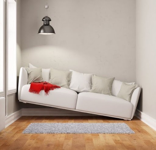
You may not believe me, but this occurs more often than designers would like to admit. People tend to fall in love and impulse buy furniture without taking measurements or considering how items will flow in a space.
Sometimes an item can be too large for the space...
Or too tight, offering very little clearance around the room...
Sometimes furniture is a tad too small and looks like it is being swallowed by a room...
So, before I go further, let’s have a quick design lesson!
Measurement refers to evaluating if the length and width of an item will fit a room. Scale refers to how all design pieces (furniture and accessories) will fit together within the architecture of that space. So, out-of-scale furnishings end up being either too big or too small for a space. Ok... so now we’re ready to jump back in!
Since the start of the pandemic, the wait times for furniture have been six months or more. Can you imagine the number of households who waited this long only to find that the furniture didn’t properly fit the room in terms of size and proportion?! Worse yet, delivery teams that arrive only to realize it can’t fit through the front door? Yikes. Let’s avoid this by following the tips below.
Evaluate each décor item going into the space separately to ensure cohesive fit for all the items in the room. I use AutoCAD to create my layouts, but if you don’t have a CAD tool, use painter’s tape and layout your furniture that way. Either step will help you avoid costly mistakes.
So, put the credit card down; spontaneity will not win where these types of interior design projects are concerned. Instead, get the measuring tape and take the time to develop a well-proportioned plan for the room. You’ll thank me later!
Mistake #4 – Area Rugs that are Too Small for the Room
Is it just me or are we willing to finally address the elephant in the room? Yes, the small rug over there in the next room? My dear friend, it has to go. It’s time... and it’s OK!
Avoid buying an area rug that is too small for the space. Again, this is an interior design no-no.
Remember when we talked about scale earlier? Well, that applies here too. A rug that is too small for the space looks out of scale, and more importantly, it cheapens the look of the entire room.
How do you avoid this mistake? Here’s a general rule of thumb. If you are buying a rug for a living room or family room, start with a rug size of at least 9x12 or 11x14 at least!
For the living room, all of the seating and tables should touch the area rug.
For the bedroom, at least 2/3rds of the bed should sit on the area rug.
And for the dining room, the table and chairs should all sit on the area rug.
If the case of the “too small rug” is true for you, perhaps you could move the current rug to another room. Alternatively (depending on the size, fabric, and/or design of the current rug), you could place it above a larger natural fiber rug, so it’s not a total lost cause.
The bottom line here... size indeed matters.
Mistake #5 – Curtains that are Hung Low or Don’t Touch the Floor
Ok, let’s use the power of imagery here again... Have you ever seen a very handsome, well-dressed man, only to look down and notice his pants are too short? Well... truthfully, I hope that vision lands because, with newer fashion trends, that’s precisely how some men are wearing their pants now. But I digress! The fact is, for years now, so many households have been hanging curtains all wrong.
Don’t fall into the common trap of these two mistakes where window coverings are concerned. This is a low-cost, easy mistake to avoid, so let’s cover it!
The first mistake is hanging your curtains just at the top of the window trim. You’re not taking advantage of the wall height. A curtain rod installed too low robs you of the opportunity to create a beautiful focal point in the room.
To correct this, place your curtains as close to the ceiling as possible. Curtains placed higher on the wall make the space feel and look bigger. Before you run out! Remember you’ll need to purchase longer curtains.
The second mistake is curtains that don’t touch the floor. Again, this feels like an incomplete look. We don’t want to look like the tailor that ran out of fabric! Remember that handsome guy we saw at the top of this section?!
There are one of three looks you should try to achieve when hanging curtains:
(1) The slight float: hanging your curtains about a ½-1 inch above the floor,
(2) The kiss: curtains that barely touch the floor,
Or (3) The puddle: well, it does just that; it elegantly puddles on the floor. This is a popular option for those who have a knack for flair or ultra-feminine looks.
Choosing one of these three options gives your windows a well-spent, complete design overhaul. As simple as this décor item may seem, window coverings, when done correctly, can immensely add to the entire aesthetic of a room.
Luxe and cozy, anyone? I think so.
There’s no mistaking it...that’s it!
It’s a wrap. We’ve covered the top 5 most common interior design mistakes. I hope you have found these tips helpful so you can avoid these pitfalls in your home’s interior design or business.
If you haven’t already checked it out, go to my YouTube channel and watch my “What’s In and What’s Out” Design trends video. It explores timeless design options that will not steer you wrong. After all, I do these videos because I feel like your home should inspire you, and we all should make the most of what we have.
Before you leave the channel, be sure to hit the Like and Subscribe button so you can stay up to date on all the new and exciting things I am working on for you all! With much appreciation – see you next time!


